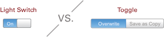
The Difference Between a Light Switch and a Toggle in UX.
Here at DesignMap we go to lengths in determining the best controls for our clients.
Often in the course of explaining our choices, we uncover important distinctions, that we feel adds to the growing field of UX. One of those instances came up recently regarding the use of a light switch vs a toggle. Here is how we see the differences.
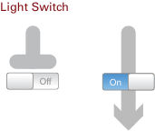
Light Switch
Light Switch is a sliding button which displays its current state, clicking the button will switch states. A Light Switch should be used as a gate, in scenarios where simple binary functions are necessary. For example turning on a set of features or search criteria. In the diagram below the grey line represent information flow with the Light Switch acting as a gate: either the information flows or it is stopped.
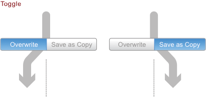
Toggle
Toggle, a button which only allows for one item to be selected at a time, turn off unselected items as a selection is made. The Toggle should be used as a pivot where both items in the Toggle are options – for example, filtering a grid by one of the options in the Toggle. In the diagram below the information flow is diverted to either option of the Toggle.
Best Practices
Light Switches generally should have very short items names, “On” and “Off”, “Yes” and “No”, etc. Additionally, to the user, the name that is not selected should be able to be inferred from the selected name. For example, most people would know that if they see “Yes” the opposite would be “No”, even though they cannot see the word No in the Light Switch.
Toggles need to show all options to the user as the non-selected options cannot always be inferred by the selected option
Furthermore, Toggles could have more than two options, so showing all options at a glance is imperative.
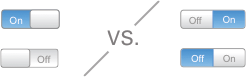
Incorrect Usage
In the case of Toggle switches, “On” and “Off” do not work well. The reason behind this assertion is, that it requires users to read two labels in order to know the current state of the switch. Additionally there is no color difference between the two options, which would also help with the determining the state of the Toggle.
Both Light Switches and Toggles have places in modern web applications. Hopefully the above descriptions will help clarify which scenarios those controls are better suited.
What do you think? Do you use Light Switches in your interaction design?