You finally got the green light.
Product adoption has been low for a while, UX-related support tickets are sky high, and your sales team keeps getting burned by better-designed competitors. It’s been stressful, to say the least.
Now, at last, you’re going to reverse this stagnation by building the design system this enterprise deserves. Efficient production, consistent branding, streamlined innovation; it’s so close you can almost taste the success (to me, it’s blue Slurpee flavor).
But chaos lurks in this process. And like an indignant toddler throwing a fit in front of you at the checkout line, chaos is ready to slap that Slurpee right out of your hand, splattering you in blue-raspberry shame.
I’ve been taming chaos my whole career, and let me tell you: there’s nowhere in the enterprise design system process it can do more damage than when you’re trying to nail down the creative direction.
I’ve seen it dozens of times. People get into bitter squabbles over minor elements, egos get bruised, discussions derail easily, and for some reason, seriously, nobody can agree on a shade of green.
Worst, the creative direction of an enterprise design system is one of the first things you have to get right. Nothing else can proceed until you’ve nailed this.
So I’m leveraging a little of my own experience to help you over this particularly high hurdle and keep your enterprise design system on track. First, I’ll explain how chaos in your creative direction can be the biggest threat to this whole process, then I’ll detail my simple 5-step solution to stopping it.
Why It Can Be So Hard to Get Alignment Around Your Design System’s Creative Direction
I’ve been through dozens of these things. The #1 most important thing I’ve learned over the years is this…
**People get really really passionate about colors and typography.
It’s crazy. I can’t tell you how many times I’ve seen teams get hung up debating these things. And without the right process, it can quickly get out of control.
Months get wasted as people fight over details that are ultimately unimportant to the end-user. Hours of work are undone by spur-of-the-moment gut feelings from someone high on the food chain. Frustration mounts, people become less inspired, and the quality of the design system begins to tank.
As the most visible part of creating your enterprise’s design system, with people from sales, marketing, leadership, and every product team in your organization involved, this is something you’ll want to avoid.
Thankfully, I’ve developed a nifty process for building alignment on those notorious abstract elements—colors, typography, animation/movement, and more. This process hasn’t failed me yet. I’ll share it with you right now.
How to Align Stakeholders Around Your Design System’s Creative Direction in 5 Simple Steps
This process keeps the planning of your design system’s creative direction on track, and gets people pulling together to move the project forward.
Keeping people on track is the easier part. As you’ll see in Step 2, we achieve this primarily by creating abstracts with context (e.g fake prototypes that look like an actual product). This way, making creative decisions doesn’t have to be based on a gut feeling — everyone can see how choices play out in “reality”.
Getting everyone pulling together is the bigger challenge. To conquer this, I’ve woven close collaboration between often disparate teams into each of the steps in this process. When people have truly no other choice but to work well together, they usually do.
Let’s get into the actual steps:
Step 1: Research & Brand-Review
Get set up for success by getting a full analysis of your product. This should be an expansive and intensive look at everything that’s been done to date: the product’s capabilities, the problems it solves for the user, the features it offers, the timeline of those features and changes, acquisitions and their role in development, and competitive brand positioning.
You can’t choose the right creative direction without this.
I. Component Audit
This is just what it sounds like. It’s a full audit of your products in which you review and catalog each component. But there’s a catch. It’s not about doing inventory. It’s about making everyone look at what they’ve built, take ownership of their mistakes, and see the reality of their work.
It’s very easy, especially early in the process, to blame other people (or other teams) for the product’s weaknesses.
“Look, if Design could just stick with something consistent the product wouldn’t look so messy!” etc.
But doing this component audit brings everyone in direct contact with their mistakes, blunders, oversights, or laziness. It’s both a humbling experience and a wake-up call.
For this reason, every team needs to be involved. Engineers, designers, marketers, leadership - everyone needs to see their contributions (for better or worse). I’ve found this (single or multi-day) workshop works best by gathering people in the same room to perform the audit together.
II. Stakeholder Interviews
These are the people who your design system will be created for: Product Managers. Engineers. Designers.
These are the people who will use the design system to service their users. Each product team will depend upon this system to deliver a cohesive and consistent service. It has to work for them, and take their needs into account as much as it does the user.
I like to perform these interviews early, so I know that everything coming after is in alignment with the needs and expectations of these key individuals.
III. User Research
The user needs to be at the center of the creative direction process at all times. You can’t do that correctly without first knowing core aspects of your audience.
This is an excellent time to review and refresh customer personas and target audience specs. Things may have changed since your teams last aligned themselves around the MVP, and even if it hasn't, this is still a good exercise.
IV. Brand Review
This should be a little more in depth than a simple review of your previous branding guidelines. Go into the history and sync up with marketing to investigate the decisions behind these previous branding choices.
What has the brand style looked like over the years? How has it evolved (or not)? What aspects of the brand must remain static (i.e cannot be changed), and what can be updated? How has the product represented the brand and conveyed brand values? Ask these questions, and more.
In addition, you’ll want to keep marketing in the loop as you move forward with this process. Their perspective is very helpful, they often have an excellent history of the company's branding aesthetic and personality, and they call a lot of shots.
In one instance I recall, the team had already gone through several rounds of font and style selection. We were in pretty deep. Then we brought it to marketing. It turned out they’d had their hearts set on a specific font for the marketing—they’d already produced it and they weren’t going to change it. We had to do a lot of backtracking, and we’d wasted a chunk of time on a discussion over something that wouldn’t ever appear. I never again made the mistake of leaving marketing out of the conversation.
Step 2: Create First-Round Abstracts
Choosing a creative direction can easily become overwhelming.
You can't just show colors and fonts by themselves. It’s too abstract. Without context, people only have their gut feelings and personal preferences to go on. People get hung up on these. Disagreements flare. You see where this is going…
On the flip side, you can’t just apply new colors and fonts and animations to the existing product. People have really intense emotional reactions to seeing their product (and work) immediately changed. The reaction could be good or bad. You might get “I hate it! This is all wrong!” OR “Oh my stars, that’s perfect!” from different people at the same time. As you might imagine, that can devolve and slow things down pretty quickly. .
Instead, you have to do this “Goldilocks-style”. To too abstract. Not too realistic. Just right.
So what we create a “fake” screen for the product that puts the focus purely on the UI element in question. This doesn’t look anything like the (and probably won’t even resemble) the final product, but it provides a tangible and neutral canvas for discussion.
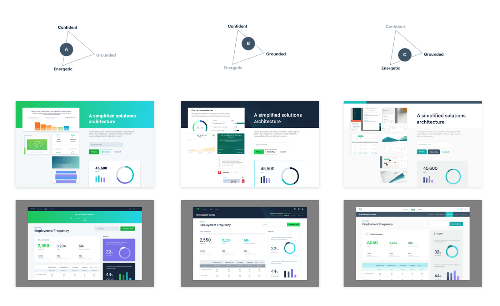
These fake screens give a sense of reality to your creative decisions. You aren’t just looking at a bunch of different greens, you’re looking at those greens in use on headers and buttons and fonts. It might not be the final product AT ALL, but it gives enough context to facilitate expedited decision making.
Step 3: Feedback
Getting feedback is easy. Getting good feedback is a real challenge.
Good feedback means that everyone is contributing all their ideas. It’s important that everyone feels comfortable speaking their ideas, and that everyone feels heard when they do. Otherwise, the collaboration falters, and the ideas get stunted. It’s my experience that the best ideas are formed by this collaborative process involving many minds, not your solo genius maverik types.
Getting equal participation is often the greatest obstacle. Frequently, once leadership has spoken up and voiced their opinion, the sharing stops.
But it doesn’t have to be someone in a position of power. Different levels of comfort with group communication can highlight some team members and sideline others.
To combat this, we ask for silent feedback first. This can be a sticky-note exercise, or any other written form of feedback. After this, we’ll go around and get comments on what people have written before putting the feedback into action.
Step 4: Iterate
This isn’t so much as a step as it is a repeating of all the other steps. Get feedback, go back, get the next piece of the creative direction nailed down, and repeat until the whole thing is rock solid.
While it depends on the scope of the project, this should occur over a matter of days, rather than weeks or months. Waiting too long between meetings slows things down and brings down the energy.
Note: As you iterate and narrow down your creative direction, your style tiles or fake screens should look more and more like the actual product.
Step 5: Validate
Who doesn’t want validation? This should be the best step! Jokes aside, it’s a crucial step.
Here you’ll have engineering code live prototypes of the pages to prove to leadership that your design system works. Executives aren’t privy to a lot of technical details. Their focus is the bottom line, and this project’s impact on that. They’re looking for this to lower churn, increase revenue, increase engagement from users, improve their brand, etc.
Up until they get some kind of proof this is going to do that, they’re stressing. It’s a red line on the balance sheet. These prototypes prove to them that the design system will work with the codebase.
Creative Alignment is the Secret to a Streamlined Enterprise Design System Project
Unfortunately, I don’t have any “design system hacks” or quick-and-easy tips.
I do have a methodical process that helps you quickly build creative alignment and make essential decisions while maintaining your enterprise design system project’s momentum.
When setting the creative direction goes smoothly, it sets a solid foundation for your whole design system. It becomes a fully realized stage of your organization's digital maturation.
And it’s that level of digital maturity and innovative spirit that distinguishes the real power-players from the slightly-above-second-string. Now, with this process in your toolbox, you’re well on your way to developing a top-level design system of your own.
Congrats :)
If you’d like help building your enterprise design system, give us a shout! We’ve worked with some big names on projects like these and are always happy to get our hands dirty.