6 of the Best UX Design Agencies in the San Francisco Bay
 Audrey Crane
13 min read
The VC-backed gold rush is going strong here in the San Francisco Bay, and it’s only getting stronger.
Bay Area companies have raised an astounding $88 billion so far this year, and for the first time ever, the region may pass $100B by year’s end.
That’s crazy.
I’ve been designing software here for over 25 years, so let me tell you: the amount of activity lately has been bananas. We’ve seen a huge uptick in demand for UX design and consulting services. Everyone knows top-notch UX/UI design can make the difference between an everyday struggling startup and the next Carta, or Canva, or AirBnB, so everyone’s clamoring for talented UX/UI designers.
Problem is, finding these designers isn't easy. Tech giants like Google or Facebook snap up the bulk of the talent, and it can be tough to gauge which UX design agency here in the San Francisco Bay has the right expertise and skillset for your needs. That’s why I wrote this post.
To help you find the right UX design company, I’ve assembled a list of 6 of the best UX design agencies in San Francisco and the greater bay. I’ve broken these agencies down by their specialty and unique expertise. I’ve also included helpful questions, red flags & green lights, and a breakdown of how UX agency pricing works with a pricing analysis from over 60 Clutch reviews.
By the end of this post, my hope is for you to be equipped with at least one strong candidate studio to reach out to, as well as the information and perspective you need to properly evaluate which of them is right for you.
Okay, ready to get started?
If you’d like to jump to a specific section, use these links:
- How to Pick the Right San Francisco UX Design Agency
- Top UX Design Agencies in the San Francisco Bay Area
- Best for B2B Product Strategy And Design
- Best for Consumer Applications
- Best for Mobile App Design
- Best for Website Design
- Best for Marketing Design
- Best for UX Research
- How Much do San Francisco UX Design Agencies Cost?
- How Does UX Design Agency Pricing Work? (Examples included.)
Disclaimer: Not All UX Design Studios are Created Equal
There are a lot of design agencies out there, but a solid 90% of them probably aren’t a good fit for your business.
Each agency has their strengths and weaknesses, different obsessions, passions, concerns and particular industry expertise. Agencies do their best work when projects align with their strengths, so it’s really important to make sure you pick the right one.
After all, picking the wrong UX design company can lead to some serious disappointment.
I read a terrible review on Clutch the other day. Client was originally quoted about $200k. After a series of major disappointments, the SF-based UX agency told them they’d need to pay $1 mil to finish the project. They sued the agency. The agency clapped back in their review. It was a miniature soap opera.
I’d like to never read one of those again, so without further ado, here’s the guide I put together to help you find the right UX design partner the first time around.
How to Pick the Right San Francisco UX Design Agency
Many companies look for a San Francisco-based design consultancy because they or their investors want their product to look and feel like a “Silicon Valley Grade” product. I’ll leave it to a grad student to suss out the je ne sais quoi of Silicon Valley design, but I’ve heard it enough times to believe in it.
Finding the studio that’ll go the distance requires that you ask the right questions during the buying process—both of the agency and your team. In my 25+ years working in digital product design, I’ve learned to ask agencies certain questions and recognize certain traits. I’ve laid these out below.
Questions to Ask Your Internal Stakeholders
Hiring a design agency only to have them pulled every which way by differing opinions is a great way to waste money on something that isn’t going to make anyone happy.
To avoid this, ask your internal stakeholders the following questions:
- What is our goal with this project?
- Are we aligned in our goal–can we present a united front?
- How long will it take to get finances squared away for a project like this?
- What is the value we expect to get from this design work?
NOTE: A design consultancy should ask you these questions too, and maybe help deepen or tune your team's understanding of and alignment on their goals. But getting the ball rolling before speaking to design agencies can help speed things up, and avoid having your goals be "steered" too much by the sales process towards whatever a particular consultancy wants to sell.
Questions to Ask Prospective UX Design Companies
Vetting a studio is partially about finding someone who works the way you want. If someone isn’t as responsive as you’d like, or seems too controlling, there’s another firm out there.
Ask these questions to vet digital agencies:
- What areas and industries do you specialize in?
- How do you support clients after handoff?
- How do you keep this process transparent?
- Are the people pitching me this service the same people who will be working on my project?
NOTE: This is an important one. A lot of agencies will use their “A team” during pitches, then have their “B team” actually do the work. Make sure you talk to the team that’ll actually be doing the work. - Who are your references?
- What don’t you do?
NOTE: Agencies won’t be expecting this question, but they should have a very clear answer. They should know what does and doesn’t work for them. - What do you expect from us as the client? What do we need to be prepared to do to help?
Questions to Ask References
Do not hire a design studio without asking for references and following up with them. Of course, they’re sending you to select people, but you can still find out what kind of company they are to work with by asking the right questions.
Ask these questions to your studio’s references:
- What is this agency's working relationship like? How did they interact with you day to day?
- What was their attitude throughout the process? Did you like how they worked?
- How did the handoff go?
- Do you feel like you got the value that you paid for?
- What impact did it have on your business to work with them?
- Will you hire a design studio again? If so, would you use this one?
UX Design Agency Red Flags (and Green Lights)
Picking the right studio is like going on a date. It’s not enough for a meeting to just go “okay”–you’ve gotta have compatibility and chemistry. Here are a few cues I generally consider “red flags” and “green lights.”
Red Flags (Don’t Hire An Agency If…)
- The agency can’t immediately provide a list of reliable references. (Run!)
- They develop grand plans and solutions on their own after a single meeting, then present these to you. (The process should be collaborative and iterative.)
- or... they've done this exact thing before and already know everything they're going to do.
- They are resistant or refuse to show you actual work in progress—you only get to see the slick brochure.
- They seem bored by your project or write it off as simple.
- Your project seems too small or inexpensive for their digital agency.
- Their team has only ever worked at agencies, and has no in-house experience.
Green Lights (It’s a Good Sign If…)
- They ask a lot of questions and want to dig in immediately.
- They begin to add value and help your team while you are still in “sales conversations.”
- They seem excited and enthusiastic about your project in a way that is almost contagious.
- You genuinely like the people you are talking to and have good chemistry.
- You meet the actual designers who will be working on your project in the first few sales
conversations.
Top UX Design Agencies in San Francisco
This isn’t a ranked list–it’s a directory of agencies based on their unique specializations. If you’re gonna pick the best agency for your project, it helps to pick one that’s internally obsessed with the kind of thing you’re working on.

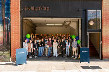
DesignMap
Best for B2B Product Strategy & Design
We’re living in a crazy time.
New technologies are emerging. Massive industries are getting disrupted. All of it’s happening faster each day. Disruptive unicorns are riding these changes to multi-billion dollar valuations, while slow-moving incumbents see their market share dwindle.
B2B companies know they need to innovate. They know great battles will be won or lost on user experience.
The problem?
Today’s B2B environments are so complex. Between market dynamics, organizational silos, legacy tech stacks, and disparate datasets, creating a delightful and cohesive user experience isn’t easy.
Which is why we founded DesignMap, a full-service UX design consultancy.
Since 2006, we’ve helped many of today’s top B2B companies harness complexity to build disruptive, delightful product experiences. We have a unique process in which we develop and align your organization around a 3-5 year product vision, and then facilitate execution with a suite of end-to-end UX design services.
Our process has powered many of our clients to successful fundraises and exits, including ExactTarget’s $2.5B acquisition by Salesforce, or Carta’s $500M series H.
If you’re a B2B designer, entrepreneur, or product leader (in California or otherwise), we’d love to hear from you.
Website: designmap.com
Industry Focus: B2B, FinTech, Healthcare
Most Notable Project Example: Salesforce Marketing Cloud, Carta Equity Management Platform
Fun Facts:
- More than half of DesignMap staff is female.
- Clients often drop by on Fridays to award “pure gold” to teams who’ve gone above and beyond.
- Three of four partners worked at Netscape.
Frog
Best for Consumer Applications
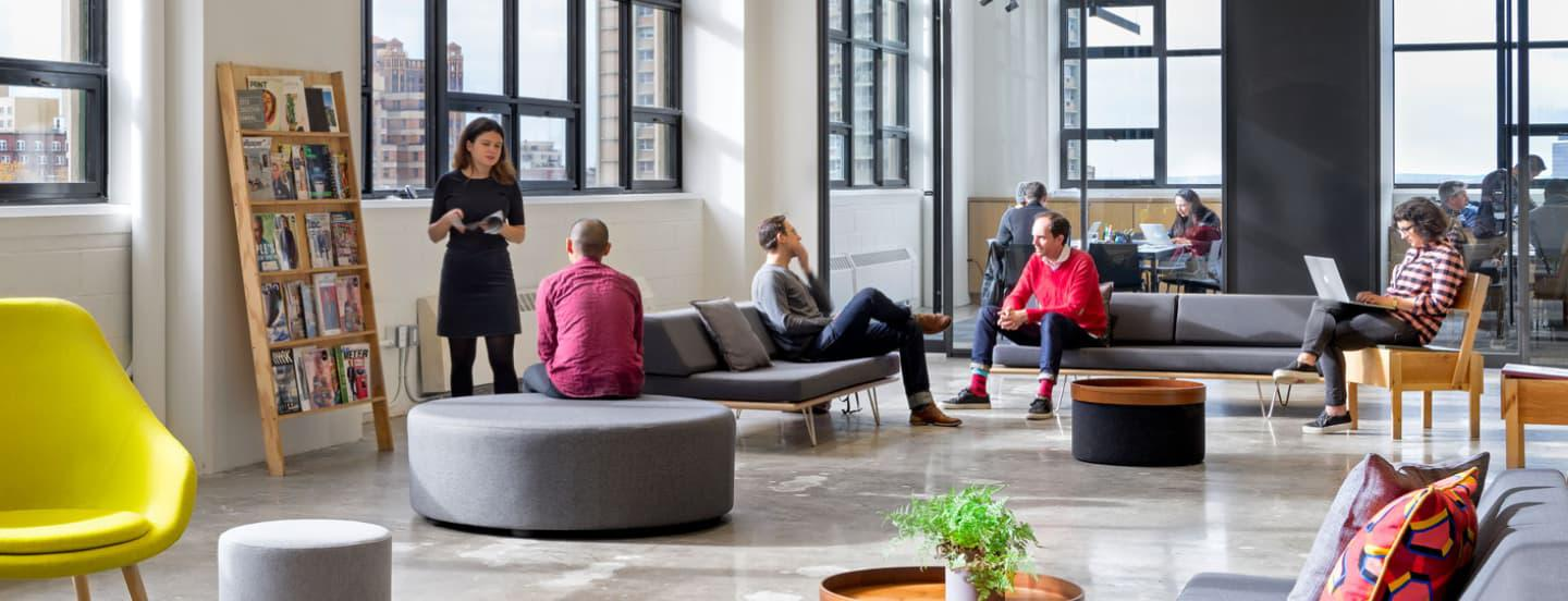
Frog is a huge company that does “do everything”—but their consumer and industrial design in particular is top notch, and they have some great designers (see for example this case study on a gaming system to help kids be more physically active). And they’re doing some really savvy thought leadership these days, such as this article on How Organizations Can Win on User Experience.
Website: frogdesign.com
Industry Focus: Consumer Products
Most Notable Project Example: Nestle
Fun Fact: Their thoughtful work on Redesigning the Pelvic Exam became semi-famous in designer circles, even though it was inspired internally by their own team, rather than created for a client.
Clay
Best for Mobile App Design
Clay is a small company with an astonishing A-list of clients. You can see why if you peruse their gorgeous case studies for B2B and B2C mobile applications, from Coca-Cola to T-Mobile.
Website: clay.global
Industry Focus: Business and Financial Services
Most Notable Project Example: Slack
Fun Fact: Used Speedtest to gauge your WiFi speed in the last 8 years? Thank Clay for the lovely UX.
Eight25Media
Best for Website Design
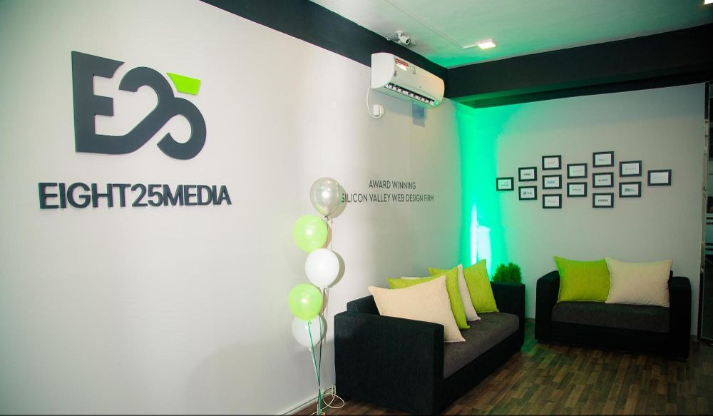
Usually when people are searching for “website design”, they need help with content-based sites (not web-based applications) built for marketing purposes. Designing these sites requires an intimate knowledge of digital marketing and content management systems. Eight25Media fits the bill on both fronts. With some presence in Silicon Valley as well as off-shore resources, they’re also quick and reasonably priced.
Website: eight25media.com
Industry Focus: Application Platforms
Most Notable Project Example: Hyundai North America
Fun Fact: Actually based in San Jose, Eight25Media was voted the #1 web design agency in Silicon Valley in 2017.
Iron Creative
Best for Marketing Design
Over the years, we found that a lot of people searching for “interaction design” are actually looking for marketing rather than UX design. We had so many inquiries for B2B marketing & brand identity help that a few years back we launched a search to find a firm that we’d be happy and confident sending any of our friends to. We landed on Iron Creative.
Not only do they really know their stuff, but an hour with Matt and John, the Partners, is as entertaining and cathartic as an hour in a comedy club.
Website: ironcreative.com
Industry Focus: Brand Marketing
Most Notable Project Example: Levi Strauss & Co.
Fun Fact: Iron creative has been working with Levi’s for the last 10 years. If you’ve seen an ad for the iconic jeans in the last decade - you’ve seen Iron Creative’s brilliance in action.

Portigal
Best for UX Research
Steve Portigal wrote the book on user research (several, in fact). He has single-handedly done more to contribute to the field than anyone else we know, and yet, somehow, you can still just talk to the guy. Crazy. Steve can both run in-depth research himself, and help build your research team’s chops.
Website: portigal.com
Industry Focus: Corporate Consulting
Most Notable Project Example: Chevron
Fun Fact: Steve wrote a fantastically entertaining book called Doorbells, Danger and Dead Batteries about when things go wrong in user research (and how to handle them!).
And now, let’s get to the very first question almost everyone has about hiring a design agency:
How Much Do San Francisco UX Design Agencies Cost?
You’ll find a lot of people answering this question by giving you some hourly rate, but that doesn’t come anywhere near answering how much a UX design project will cost you. We took some time compiling pricing data from over 60 SF Clutch reviews and broke it down by Project Type.
Here are the results:
UX DESIGN PROJECT COSTS
| Category | Avg. Cost | Median Cost | Project Cost Range | Avg. Project Length (Weeks) |
|---|---|---|---|---|
| App Design | $187,500 | $100,000 | $10k - $1 million | 44 |
| Web Design | $137,970 | $80,000 | $10k - $1.5 million | 24 |
| Prototypes | $199,756 | $137,000 | $15k - $1.3 million | 32 |
| Software UI | $182,894 | $57,000 | $10k - $1.3 million | 30 |
| Research | $212,257 | $84,830 | $10k - $1.3 million | 38 |
| Strategy | $265,500 | $130,000 | $10k - $1.3 million | 39 |
If you spend any time with this table, you'll see that it’s actually not super easy to make sense of this information. There’s not a whole lot of difference in the averages, and there’s clearly a lot of variance in the data. For each category, we found examples of projects for as little as $10k, as well as examples over $1 million.
I think the real takeaway from this chart is this: when it comes to UX design agency pricing, it really depends on what you want. No two companies or products are the same. And for that matter, no two agencies are the same.
For instance, designing the Software user interface of a multi-application B2B ecosystem is going to cost way more than a simple two-screen SaaS product. So again, it really comes down to the specifications of the project.
Having said that, some additional insight into UX studio pricing may be helpful.
How Does UX Design Studio Pricing Typically Work?
There are several different ways companies engage design agencies, but at the end of the day, most design pricing boils down to time and resources.
The main styles of engagement are:
- Staff Augmentation: Provides talented individuals to join the team like full-time employees. Costs are directly related to the size of the staff augmentation.
- Project-Based Work: This includes an up-front description of all services and a fixed fee. Additional costs or overages are covered in the Statement of Work (SOW).
- Agile engagements or Retainers: For long, ongoing or less-involved projects that do not require hitting date-based milestones. Cost is generally calculated by resources and number of sprints.
Regardless of engagement type, pricing will depend on the resources (i.e people) and time that are put into your project. This means multiplying three factors:
- WHO will be on the project? **
Junior visual designer or Principal UX designer? The Principal will cost significantly more.
- HOW long are you getting them?
Will the project take a quick 3 weeks, or will it be an entire quarter?
- WHAT percentage of their time will you be getting?
Will they be dedicating 100% of their time to this project, or just a fraction?
Even boiled down, this is still a little vague. So I’ve tried to put design pricing in as concrete terms as possible. Here are examples of three REAL projects of differing size, complete with price, timeline, and work performed (almost as it would appear on a SOW).
Small Project: Design Sprint
Project Scope: A network management startup needed help generating ideas and tackling a tough design challenge ahead of an upcoming engineering team hack-a-thon. We were tasked with acting as an outside facilitator for a traditional Design Sprint (have those been around long enough to be called “traditional” yet?), except that we spread it out across two weeks instead of one. This allowed their team to continue managing their workload as well as participate fully in the sprint. It also limited Zoom fatigue, which was important mid-pandemic.
Personnel Required: 1 Senior UX Designer (100%), 1 Director of Design (25%)
Timeline: 2.5 weeks
Cost: $13k
Work Performed:
- Coordinated design team schedules
- Set up Miro boards
- Coordinated UX research
- Provided preparation instructions to participants
- Set up and ran video conference
- Explained and directed each activity within sprint
- Participated in contributing and providing feedback on ideas
- Moderated conversations such that no one was inordinately under- or over-represented.
- Recapped and prepped for each subsequent day.
- Wrapped up the Sprint with next steps for ensuring the work had an ongoing impact.
Outputs:
- One design sprint: Thirteen 3.5 hour sessions over 2.5 weeks
Outcome:
- New product idea, tested with real users
- Internal alignment and excitement about the idea
- Plan and momentum to carry forward into execution
Medium Project: UX and UI Design for a Minimum Viable Product (MVP)
Project Scope: A tech startup was developing an application that’d extract key data from emails and .PDFs and format it into structured outputs and insights for business analysts to consume. They were looking to design and build out a MVP that they’d use to sign a number of early-adopting customers before raising a Series A. We worked with their newly-hired Head of Product to design key workflows and screens before creating production-ready UI designs for buildout.
Personnel Required: 1 UX Designer (100% for whole engagement), 1 UX Lead (100% for Phase 1, 50% for Phase 2 & 3), Producer (25% for whole engagement).
Timeline: 6 weeks
Cost: $110k
Work Performed:
- Kickoff workshops
- Collaborative ideation/design sessions
- Audit of existing product & usability
- User testing
- Conversations customers and users
- Ramp-up on product plan
- Landscape research
- Feature planning
- Workflow definition
- Team management
- User experience design planning workshop
- Detailed screen design
- Visual UI generated
Outputs:
- Landscape analysis
- Product model
- Workflow and screen concepts
- Design insights, methodology, and recommendations
- Provisional persona(s)
- Persona journey map & workflows
- Concept screens
- High-level MVP direction
- High-fidelity mockups
- Final workflow documents
- Visual user interface spec
- Following year’s design plan
Outcomes:
- Understanding of customers, their goals and pain points, and the opportunities they represented
- A designed and released product focused on that opportunity
- Team/Company alignment on what they were doing and why
- A plan for continued learning and iteration
Large Project: Next Generation Product Vision
Project Scope: An enterprise business needed help developing and prototyping a 2-3 year vision for maintaining their position as leader in the cloud-managed networking space.
Personnel Required: 1 UX Director or Lead (100%), 1 Senior UI Designer (100%), 1 Senior UX Designer (100%), 1 Producer (25%)
Cost Range: 500k
Timeline: 18 weeks
Work Performed:
- Stakeholder interviews
- User, customer, and SME interviews
- Detailed status updates
- Design Thinking & Persona workshops
- Research synthesis
- User journey maps created
- Platform vision workshopping
- Product concept workshopping/development
- UI/UX directions created
- User feedback and input gathered
- MVP design planning
- Review of product roadmap, design initiatives, design organization, roles, structure, open recommendations, operations systems and tools.
Outputs:
- Identified audience
- Provisional personas
- Landscape analysis
- System concept model
- User journey map
- Principles, themes, and KPIs established
- Platform vision key user scenarios established
- Visual design established
- Vision Clickthrough (high fidelity mockups)
- MVP Key Screens
- Core component style guide
- Executive alignment
- Design plan going forward
- Summarized recommendations for next steps
Outcomes:
- Understanding of customers, their goals and pain points, and the opportunities they represented
- A vision of possible and probable changes in the industry and the challenges and opportunities that future represented
- Team/Company alignment on specifically what would position the company to take advantage of those oportunities
- A plan for doing so
BUT, with a big grain of salt...
It may be helpful to be aware that any consultancy worth its salt is going to be talking to you about the value their work will contribute to your company, not the cost to them of providing the work. It’s like the old “handyman’s invoice” joke, $1 for tapping on the engine, $999 for the knowledge based on a lifetime of learning where to tap.
I’ve rarely seen these pricing agreements end up entirely based on value, but it’s a fair part of the conversation. After all, you don't want to work with a firm that doesn't know or care how their work will help make you and your company successful! Both you and they should know the value of what you’re trying to accomplish. But it's also fair for you to push back, to ask about how they do their pricing. If they really want to have some skin in the game, a conversation about equity (after a project or two so that you know one another) may be appropriate.
Conclusion
By now you should have a good idea about:
- The different specialties of UX design agencies
- Qualities and characteristics of “top” design firms, and guidelines for the determination of these.
- A sense of the top UX agencies in the San Francisco Bay Area
- Setting clear expectations on UX design pricing and outcomes.
I think that’s really everything you need to be able to make the right decision and find the agency that’ll help you build a world class digital experience. Did I leave anything out? Anything particularly helpful here? Please drop me an email and let me know!
