There’s a scene in the (alas, canceled) television show “Smash” in which an inexperienced director tells the leading lady how to say a line, a faux pas known as a “line reading.” Theater is an old profession with a well-established etiquette and being given a “line reading” is considered demeaning and humiliating.
Line Reading
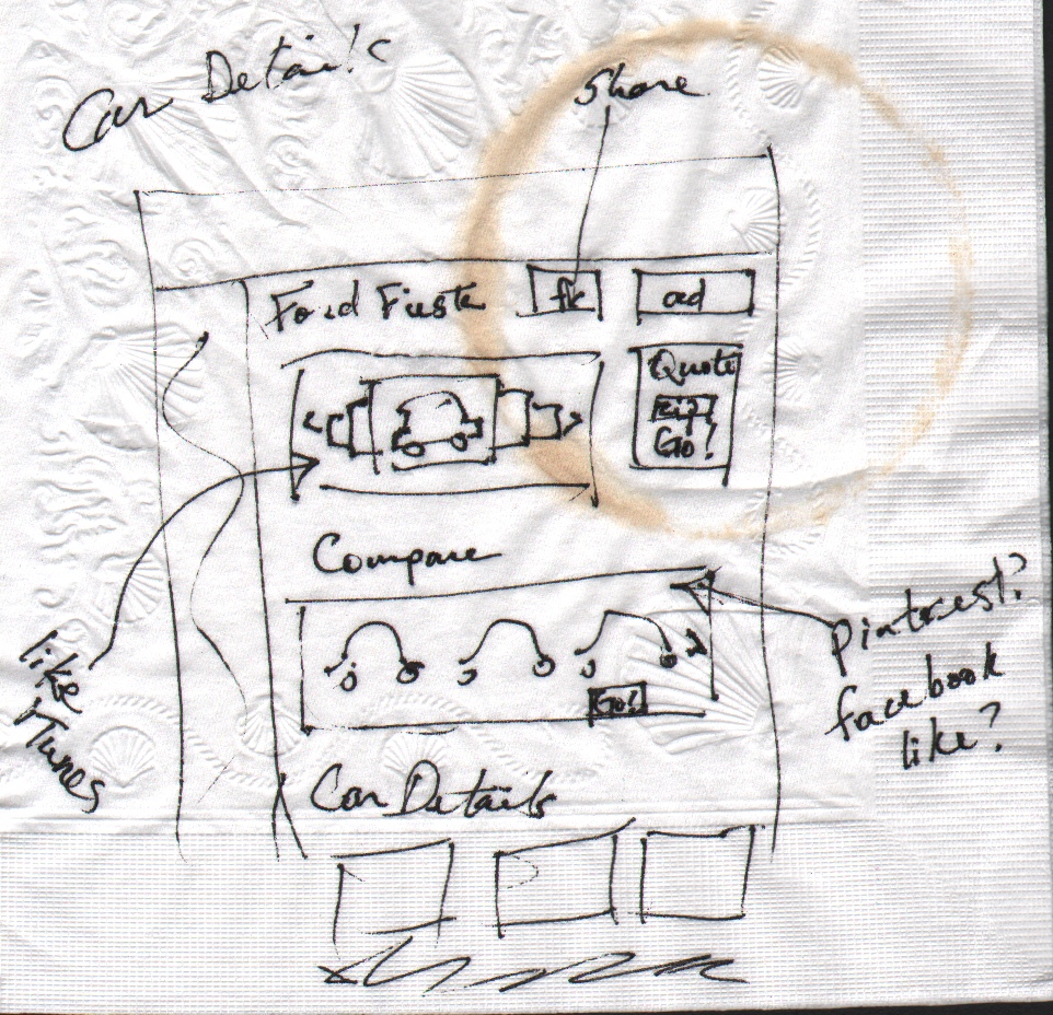
Designers know this feeling. We’ve all had a colleague, boss or client drop by with napkin sketch in hand and ask, “Can you just take this drawing and make it pretty?” These requests make us bristle, sigh, throw up our hands and even sometimes quit. Why? Because to designers they feel like the moral equivalent of a line reading: directives that ignore our professional contributions and cut our process short or ignore it altogether.
Napkins: A Design Thinking Alternative?
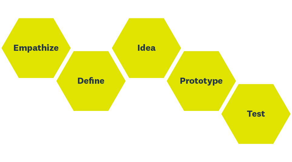
For us, designing is much more than just putting a nice patina on an existing drawing. “Design” is not a noun, it’s a verb. It’s a process that includes everything from defining user needs and concepting to prototyping and testing—a process called “Design Thinking.” Stanford’s d.school has done a lot of work here and has a nice and broadly-accepted model of Design Thinking that illustrates the idea well:
HASSO PLATTNER, Institute of Design at Stanford'
Designers are not the only professionals who run into this assumption that their work is an end-of-process activity, a simple task that can be knocked out in an hour or two. Nothing makes a communications professional crazier than a request for a “press release” about something that isn’t news. Writing and distributing a release can’t turn a new package design into important industry news. You’d be hard pressed to find a developer or product manager who hasn’t wrangled with sales and marketing over a new feature the CEO dreamed up in the shower. A product marketing colleague has complained to me about a researcher that routinely comes to her with recommendations. Not findings, recommendations. That’s a napkin too. A recent chat at a spa with my aesthetician about her pet peeves revealed that she got ‘napkins’ in the form of clients who arrive already “knowing everything about their skin and what services they need.”
Every professional has a process and set of knowledge that allows them to contribute their best to any given solution. That process is gets short-circuited when they’re handed a literal or figurative napkin. What the deliverer seems to be saying is: “We don’t need your or your contribution. Just make this pretty and we’re good.” A few other ways you might hear the same directive: “Jazz it up a bit.” “Just be creative with it.” “Fill in the details.” “Make it sexy.” “We need more eye candy.” “This just needs more pizzazz.” Or as I call it: “Sparkle-ize it!” (I did honestly have someone ask me once to “make it sparkle”.)
Yup, We’ve Been Given Napkins
Even in the relatively specialized world of UX design, we’ve encountered our share of napkins. Of course, we believe we’re in the business of helping their users and occasionally the delta between user needs and client wants creates tension. Here’s an example of just such a situation.
Wireframing tools like Balsamiq and Axure offer great efficiencies for UX design but on the down side some clients use them liberally to show us what they want. These are the digital equivalent of the napkin sketch. Here’s an example:
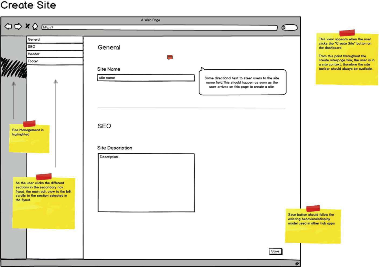
The yellow notes provided very specific instructions on how a user should interact with the page. When we looked closely at the sketch and the notes, we uncovered some conflicting issues both with the page and the larger system to which it belonged. Concerned that we may have misunderstood our client’s goals, we decided we needed to uncover the thinking process behind their UX design.
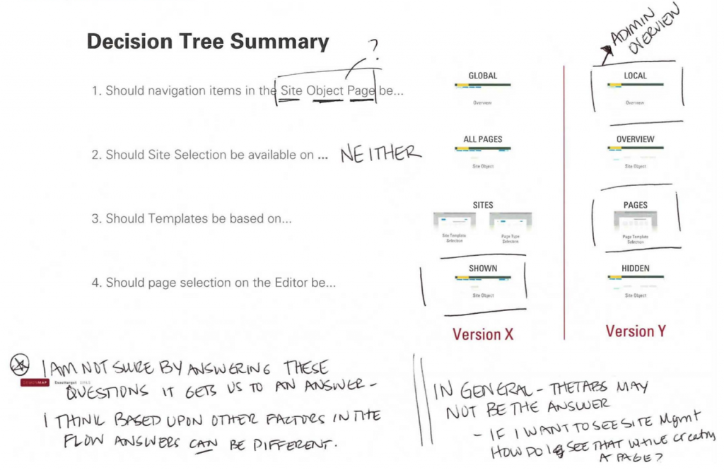
That discovery process can be difficult because clients often aren’t practiced in articulating their thinking. With this particular client, we backed up, found the points of departure from our understanding of the basics and put together a set of questions to see if we could unpack the problem with the client. We walked them through the following decision tree and then showed examples of how each decision flow would manifest in a UX design.
From a design process point of view, these questions are working on two levels. The obvious level is the ‘selection’ of the actual UX design. The less obvious, more subtle purpose is to uncover the role of design in the client’s own process and work culture. Do they see these questions as choices? Do they understand how these decisions effect overall UX flow and, ultimately, users?
Unfortunately, as you can see from the illustration, the client didn’t respond as we might have hoped.
Particularly revealing is the note, “I’m not sure by answering these questions it gets us an answer.” The remaining comments presented us with yet another “napkin”—this time sketched by hand—of how the application should function:
Clearly, getting another napkin is not the ideal result of trying to understand the thinking behind a napkin. If we’d like encounters like this to go better in the future, what do we do differently? Is there a systematic approach to improving how we respond to directives and dictates from colleagues, bosses or clients?
Consider 4th-Order Design
When a metaphorical ‘napkin’ seems to be squashing our creativity and ambition, instead of getting frustrated, it’s time to level up and apply design thinking to our own problem. Richard Buchanan, a professor of design at CMU known for extending the application of design into new areas of theory and practice, calls this approach third- and fourth-order design thinking. First and second-order design involve the creation of things and third-order design addresses activities and organized services, fourth-order design focuses on cultural systems or environments for living, working, playing and learning.
Buchanan first articulated this idea in the Spring 1992 volume of Design Issues (MIT Press), which astonishingly and tragically didn’t include any drawings–happily after the article was published Toby Golsby-Smith picked up the idea and gave us a model for it:

© Copyright 1996 The Massachusetts Institute of Technology, Design Issues: Volume 12, Number 1 Spring 1996
So how do we go about this fourth-order design thinking process? The Stanford d.school’s model for the design thinking includes five steps: Empathize, Define, Ideate, Prototype and Test. Fourth-order design applies these these steps not to the problem on the napkin but the problem of the napkin, which is the manifestation of a larger misunderstanding of the role and process or design.
Though the requester may believe that they are at the prototype stage, you will be starting with step one which is: find your empathy. Talk to the person handing you the napkin to understand their goals, motivations and needs. Here are some typical motivations and beliefs underlying “Sparkle-ize It!” requests:
- There’s no time to think about or discuss alternatives. The requester needs a picture for their demo or presentation now.
- The best solution is on the napkin. They’ve done the heavy lifting, all they need now is a ‘design.’
- It’s your job to make their work look pretty and classy.
- It’s hard to explain the idea with words, but a picture would make it all clear.
If “no time” is the driving force behind the napkin, there isn’t much room to do more than follow directions. But if questioning uncovers other motivations (your “define” step), you have a lot of flexibility to step back down into the design process, specifically at the ideation stage.
Ideate: 7 Techniques
We’ve collected some techniques that work particularly well for this “defined napkin” stage, some curated from others, some variations, some our own. These ideation techniques offer a fast track for uncovering new perspectives and sparking creative thinking. Some of them are inherently quick and relatively simple to execute, while others are narrowed versions of much broader brainstorming and idea generating methods. All of them should help you communicate options other then “sparkle-izing” to your boss, colleague or client.
Technique 1: 3 Things
Ask the following three questions:
- What is the most important thing that this sketch does?
- What do you wish this sketch did better?
- What works would you use to describe this sketch?
Use the answers to create three new versions of the sketch right there. Ideally, this process will open up discussion and may even uncover the need for stepping back further in the design process for more defining and empathizing.
Technique 2: Concept Map
Create a concept map by listing the objects in the sketch, drawing connections between the objects and then labeling those connections. Looking at the sketch’s content as individual elements with specific relationships can uncover missing or redundant connections, again pointing the way back to earlier design thinking steps.
Technique 3: Competitive Analysis
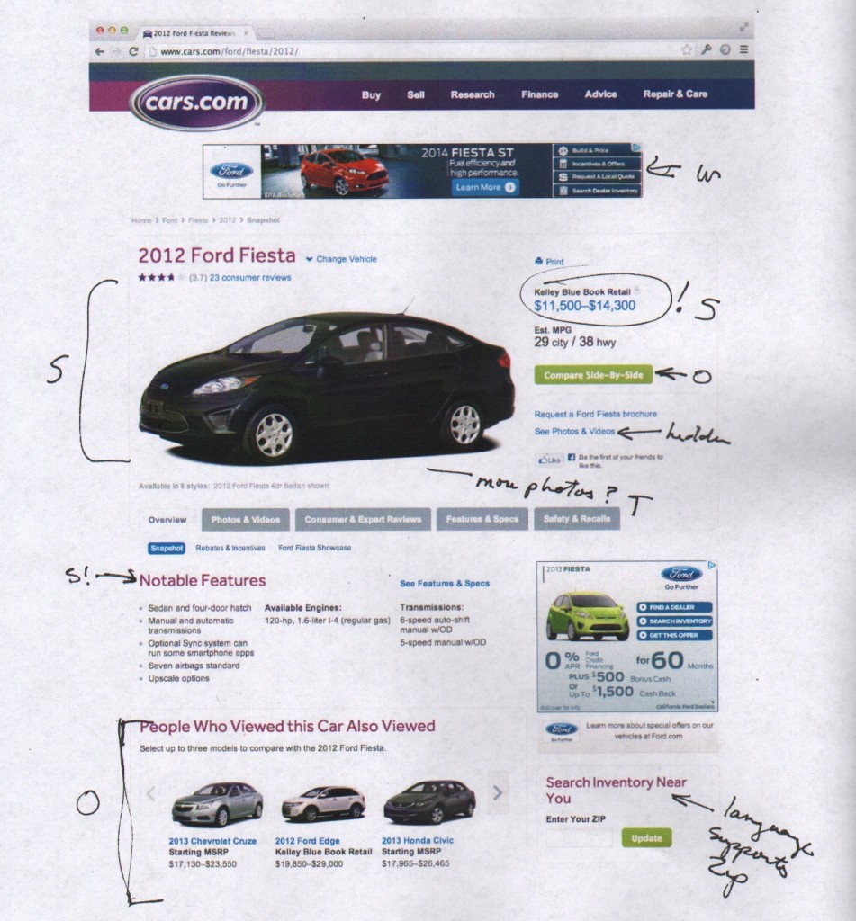
Find examples of similar work from competitors and do a quick, light-weight analysis of their strengths, weaknesses and threats. This exercise isn’t meant to be exhaustive: the intent is to use competitors’ work as jumping off point for new ideas. Something as quick as a few call-outs on a printed screen might be sufficient to suggest new ideas worth exploring:
Technique 4: Retrace Their Steps
Ask your napkin holder to describe the sketch and then repeat back to them what you heard. You might even redraw the sketch as they describe it. Both of these reflecting tactics shine a light on the requester’s thinking process and may prompt them to reconsider their assumptions, again opening them to new approaches.
Technique 5: Why-How Ladder
A Why-How Ladder uses why and how questions to create a hierarchy of user needs and paint a full picture of a composite user. “Why” questions uncover ever more basic human needs (Why will this product/service make you happy?) and “how” questions (How will this product/service make you happy?) reveal practical steps towards realizing that need. Answers to “why” questions move up the ladder while answers to “how” questions move down the ladder.
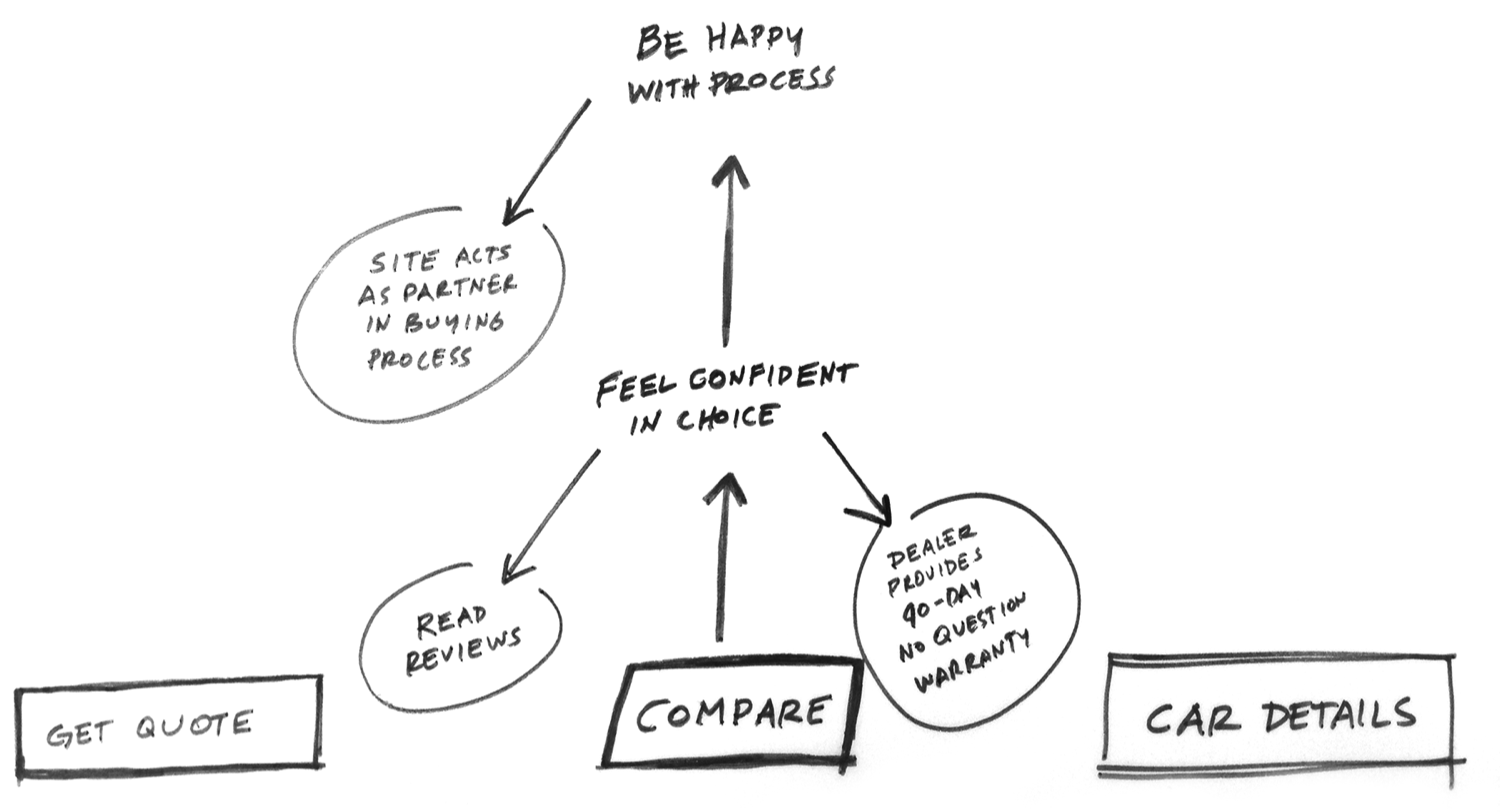
Taken far enough, “why” questions will reveal a very basic human need at the top of the ladder, such as the need “To be healthy” in the Why-How Ladder pictured here. In the middle of the ladder, needs are both meaningful and actionable. For example, “feel confident in choice” is both an answer to why a user might want “compare” (below) and how a user might “be happy with the process” (above). The bottom of the ladder is a list actionable “how” statements.
Use this method with your requester to reveal how his or her sketch reflects actual user needs and ways to meet those needs. It’s a powerful guide to how deeply user needs are being addressed, a point of consistent tension for designers who, as noted above, often see conflict between what’s good for users and what clients, bosses and colleague want. (More on this technique at the d.school site.)
Technique 6: Heuristic Ideation
Heuristic ideation technique, or HIT, is an idea generating method developed by Edward M Tauber, the man who invented the brand extension, that used matrixes and grids to create surprising and compelling new ideas. HIT’s four categories of potential matrix content include components, characteristics, challenges and characters (or personas). In the example grid below, the attributes are characters, or target users, for a specific web page and the components, or goals, of that page.
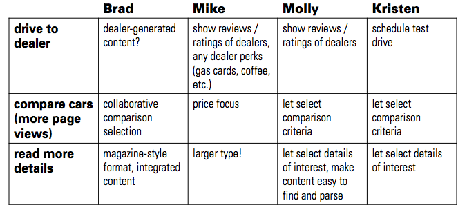
A completed matrix can uncover new combinations and new ideas—or point out where more design thinking is needed. More on this technique at the Gamestorming site.
Technique 7: Business Model Canvas
The business model canvas is a strategic management template for developing new or documenting existing business models. The template offers a visual chart for mapping the elements that define a company’s value proposition, infrastructure, customer, and finances. Mapping out a business model can lead to intense and deep discussions among on what an organization’s business model really is. Using the business model canvas is one technique for initiating just such a deep discussion, particularly if your requester is an executive or product manager. More on the Business Model Canvas at Wikipedia.
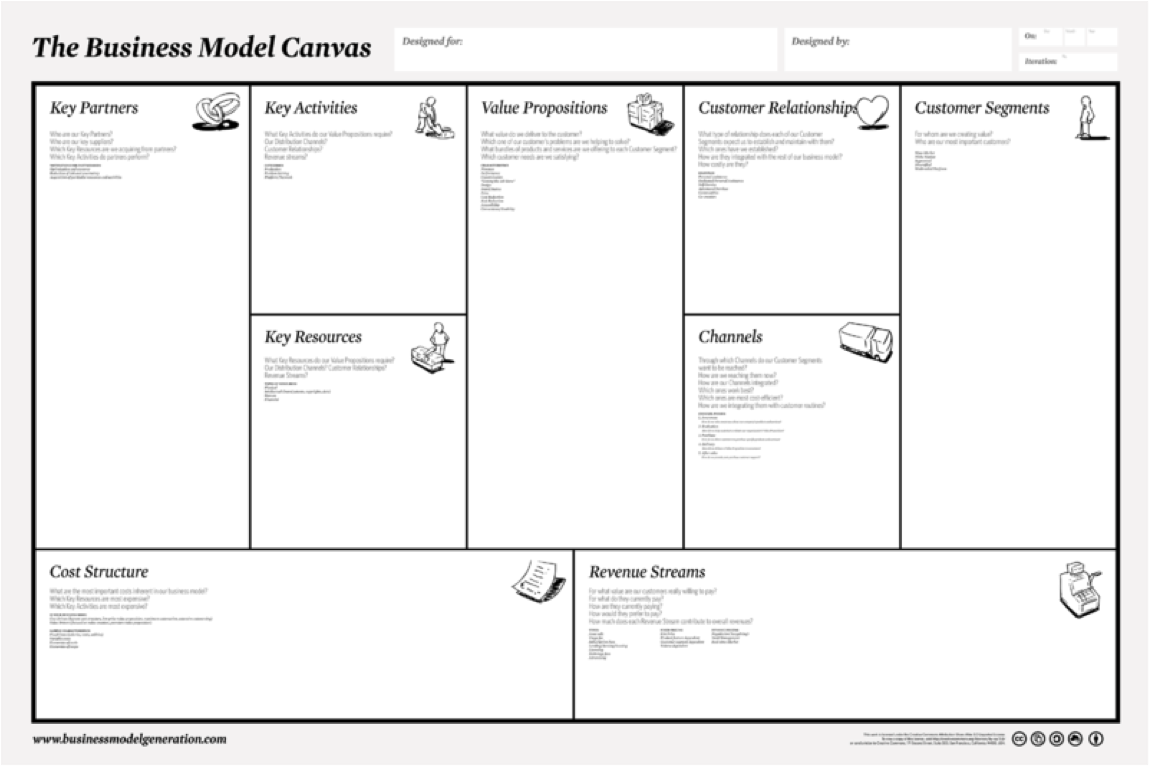
(N.B. Remember to tread lightly because you’re using their tool for your purposes. Be clear that you are only offering a draft based on your understanding of their business model. You certainly don’t want to hand them a napkin!)
Important Things to Remember When Talking About a Napkin
When trying out any of these techniques, remember it may seem to your napkin holder that you’re making their job harder and creating a process our of what they believe should be fast and simple task. Keep this frustration at a minimum by following a few guidelines.
First, find as many common points of reference as you can or, again, find your empathy. Avoid polarization by creating a “we” instead of an us-versus-them environment.
Remember they are not designers. They have not been schooled in separating their egos from their work and their skins are thinner than yours.
Give feedback respectfully:
- Try starting your comments with “I like/I wish/What if…” hat tip to Stanford d.school again
- State and observation and explain its impact.
- Be direct and sincere; that is, don’t say “You need to…”
- If you have something nice to say, please say it.
- Pause and wait for reactions.
The Long Game
You may get a napkin, find your empathy, ideate like crazy and come up with a great solution for your requester. And then it might happen all over again. When it does, it’s time for another iteration. Try another solution, or try the same solution and see if the impact varies.
The point is keep trying. Finding a working solution to solve cultural and relationship issues takes time. It’s the long game you need to keep in mind. Your higher purpose as a designer, communications consultant or any other professional, is change agent.


